1. Introduction
Ever seen a small coin spark real pride? Custom challenge coins look simple, but one wrong choice can kill the finish. In this guide, you’ll learn enamel vs die struck, plus key specs, pricing drivers, and how to order with fewer surprises.

What we will solve
● Which coin type fits your design and budget.
● Which specs change quality and lead time.
● How to avoid proof and QC surprises.
2. What Makes “Custom Challenge Coins” Custom
Spec item | Common options | Best for | Buyer note |
Size | 1.5", 1.75", 2.0" | Readability vs portability | Larger size fits more detail |
Thickness | Standard / thick | Premium feel | Thicker = higher perceived value |
Shape | Round / custom | Branding impact | Custom shapes raise tooling risk |
Relief | 2D / 3D | Clean vs dramatic | 3D adds depth and cost |
Edge | Rope / reeded / custom | Quality signal | Custom edges boost tier value |
Plating | Gold / silver / black nickel / antique | Tone + contrast | Antique hides wear better |
Color | Soft / hard enamel / none | Brand vs heritage | Too many tiny cells cause issues |
2.1 Size, shape, thickness: how specs change feel and perceived value
Size shapes first impression and legibility. Common sizes include 1.5", 1.75", and 2.0" [needs verification]. Thicker challenge coins feel heavier and more premium. Custom shapes add impact, but they raise tooling risk.
Use a simple rule for most programs. Small coins fit clean logos and quick handouts. Larger coins fit dense art and storytelling. They also allow bigger text that stays readable.

2.2 Plating options (gold/silver/black nickel/antique) and when to use each
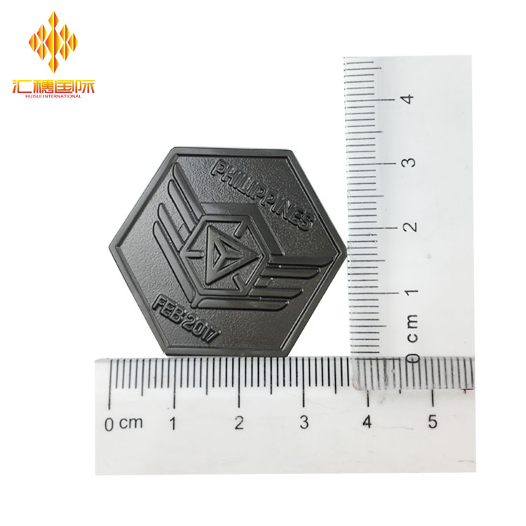
Plating sets the coin’s mood fast. Bright gold feels formal and celebratory. Black nickel feels modern and high contrast. Antique finishes add shadows that boost relief detail.
Ask for real plating samples when possible. Photos lie under different lighting and filters. Batches can also vary between factories. They can even vary between production runs.
2.3 Edges, cut-outs, and 2D/3D relief: choosing the right “profile” for your design
Edge style is a silent quality signal. Rope edges feel classic and ceremonial. Reeded edges feel like currency. Custom edges add branding, but cost more.
2D relief suits flat logos and badges. 3D relief suits mascots, statues, and scenes. Cut-outs add drama, but increase dent and bend risk. They also increase scrap risk during shipping.
2.4 Color systems: Pantone matching, translucent fills, and color limitations
Pantone codes reduce color disputes. They also speed proof approvals. Translucent fills can show metal texture beneath. They work best on bold shapes and clean borders.
Hard and soft enamel also change the surface feel. Hard enamel is smooth and polished, while soft enamel shows grooves. This finish difference is common in metal-and-enamel products.
3. Enamel Challenge Coins: Best Use Cases and Trade-offs
3.1 Hard vs. soft enamel challenge coins (look, texture, durability)
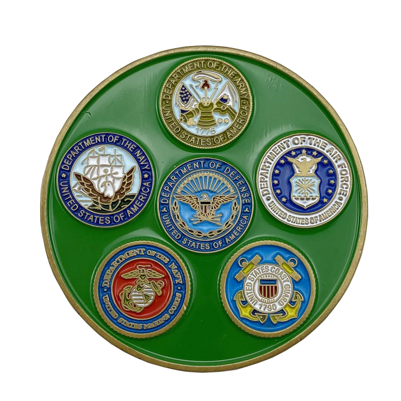
Hard enamel looks flat and glossy. It feels sleek in photos and in-hand. Soft enamel keeps raised metal lines and recessed color pockets. That tactile look is a key reason teams pick it.
Durability depends on handling and use. Enamel surfaces can chip if they take hard drops. A similar chip risk shows up in enamel-based accessories too. For desk display, both finishes hold up well.
3.2 Color fill & borders: how linework affects enamel clarity
Enamel needs metal borders to hold color. Thin borders can blur after plating. Tiny color cells increase fill errors. They also make revisions harder during proofing.
Keep shapes bold if you want clean fills. Reduce micro-text and micro-icons. Ask suppliers for a “production-safe” redraw. It can save one full revision cycle.
3.3 When enamel wins: bold logos, high contrast, collector editions
Enamel challenge coins shine when color matters most. They fit brand logos, event marks, and team mascots. Collectors like the pop and polish. It also supports variants and limited drops.
Use enamel when your message is visual. Think product launches, charity runs, or sports clubs. It also pairs well with glow or glitter effects. Those effects help make tiers feel premium.
3.4 Common enamel pitfalls (thin lines, micro-areas, muddy contrast)
Most failures start in the artwork. Lines get too thin after plating. Too many zones reduce contrast. Details then disappear at arm’s length.
Avoid gradients inside enamel zones. Use solid fills and strong outlines. Reserve fine detail for metal relief. Keep a clean focal point on each side.
4. Die Struck Challenge Coins: When Metal-Only Detail Is the Point
4.1 Die struck vs. 3D sculpted challenge coins: what “depth” really costs
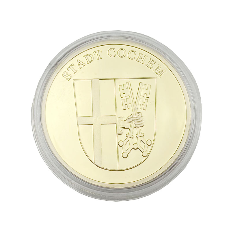
Die struck coins use metal relief for detail. They can be 2D builds or 3D sculpted builds. 3D adds realism and deeper shadows. It also increases mold time and revision risk.
If you need speed, keep it 2D. If you need drama, use 3D on one side. A mixed approach often looks premium. It also keeps cost under control.

4.2 Antique finishes on die struck coins: making details pop without color
Antique finishes highlight relief detail. They add shadow in recessed areas. This makes seals and crests look serious. It also hides minor handling scratches.
Ask how the antique look is applied. Hand-applied patina can vary between pieces. Machine processes tend to look more uniform. Your use case decides which is better.
4.3 Best-fit designs: emblems, seals, minimalist typography, heritage looks
Metal-only challenge coins look official. They fit service programs and legacy brands. They also work for executive gifts. Minimal art can feel expensive when struck cleanly.
Use bold type and clear spacing. Avoid tiny serif text on small coins. Relief needs room to breathe. Negative space boosts legibility fast.
4.4 Trade-offs: small text, wear points, proofing needs
High relief can wear on raised peaks. Edges can catch and dent in pockets. Small text can fill in after plating. Proofing matters more for die struck builds.
Request close-up proof renders. Ask for a pre-production sample for big orders. It reduces last-minute surprises. It also gives you a QC baseline.
5. Enamel vs. Die Struck Challenge Coins: A Practical Decision Framework
5.1 Visual style: bold color impact vs. “all-metal” premium look
Choose enamel if color carries the story. Choose die struck if texture carries the story. Enamel feels modern and branded. Die struck feels classic and ceremonial.
If your audience wants “official,” go metal-first. If they want “brand,” go color-first. You can also mix styles by side. They often approve faster in proofs.
5.2 Detail capability: tiny text, micro-lines, gradients, and what to avoid
Enamel dislikes tiny enclosed cells. Die struck dislikes ultra-small flat text. Both dislike crowded layouts. Simpler art often reads more premium.
If you need photo-like gradients, rethink it. Consider print-style add-ons [needs verification]. Or redesign for bold contrast. It reduces production risk and rework.
5.3 Durability: scratch resistance, color wear, and real handling
Metal surfaces will scratch over time. Antique finishes hide wear better. Enamel can chip after hard drops. A similar chip pattern appears in enamel accessories too.
For field carry, choose stronger relief and edges. For desk display, choose shine and color. For collector keepsakes, choose special finishes. They raise perceived value without huge size changes.
5.4 Cost drivers: mold fee, unit price, color count, 2D/3D
Tooling is often a fixed upfront cost. Unit price depends on complexity and quantity. More colors can raise labor time. 3D relief and moving parts raise cost quickly.
Expect price breaks as quantity rises. MOQ often starts around 100 units [needs verification]. Always confirm packaging and shipping costs. They can change your real landed cost.
5.5 Lead time & risk: revisions, proof cycles, complexity penalties
Lead time depends on proof speed. Fast approvals cut total days. Complex builds add revision loops. Busy seasons can add delays [needs verification].
Plan for at least two proof rounds. Add buffer for transit and customs. Avoid promising fixed dates too early. We can reduce risk by locking specs early.
5.6 Best-for scenarios: military, corporate awards, events, collectors
Use die struck for formal recognition. Use enamel for brand campaigns and events. For giveaways, pick the easiest-to-read design. For collectors, add variants and numbering.
Also match the coin to the moment. Formal programs prefer conservative finishes. Fan communities like bold colors and effects. Retail drops benefit from clear tiering. That makes pricing easier to justify.
5.7 Quick selection checklist: “If you need X, choose Y”
● Need strong brand color → choose enamel challenge coins.
● Need heritage seal look → choose die struck coins.
● Need quick handouts → keep 2D and fewer colors.
● Need premium gifting → add thickness and custom edge.
● Need collector hype → add serials and one special effect.
Buyer comparison table
6. Challenge Coin Design Prep: Artwork That Manufactures Cleanly
6.1 File formats (AI/EPS/SVG), vector rules, minimum lines
Vector files reduce production risk. AI, EPS, or SVG works best. Raster art can create jagged borders. They may also trigger redraw fees.
Keep minimum line thickness consistent. Avoid hairline strokes in metal borders. Ask for the factory’s minimum spec sheet. It helps you design inside constraints.
6.2 Front/back layout planning: hierarchy and focal points
Pick one focal point per side. Use negative space to boost legibility. Put your key message on the front. Keep the back for date and unit info.
Balance visual weight across both sides. Heavy 3D on both sides can feel bulky. A 3D front and 2D back often works. It also improves stacking and packaging.
6.3 Proofing process: what to check vs. what proofs cannot show
Digital proofs show layout and colors. They do not show real plating shine. Check spelling, spacing, and border thickness. Confirm edge type and any cut-outs.
Pre-production samples show real textures. They cost more but reduce risk. Use them for high-volume orders. They also help align internal stakeholders faster.
6.4 Text & numbering: legibility rules for serials and micro-type
Numbers need enough height and spacing. Avoid placing text on steep relief slopes. Keep mottos short and readable. Put serials on flat zones when possible.
If you need QR codes, be careful. They can fail when too small [needs verification]. Ask for test scans before mass production. It prevents painful rework after delivery.
7. “More” Custom Options: Finishes, Features, and Special Effects
7.1 Edge types (rope, spur, reeded, custom)
Edges change the feel instantly. Rope edges look classic and ceremonial. Spur edges feel tactical and sharp. Reeded edges feel like currency.
Custom edges can include text or patterns. They increase tooling complexity and cost. They also raise perceived value quickly. Use them for VIP tiers, not bulk tiers.
7.2 Dual plating, selective plating, contrasting highlights
Dual plating creates premium contrast. Selective plating highlights logos or icons. It can separate foreground and background. Keep transitions simple for clean results.
Ask how the factory masks areas. Masking quality affects boundaries and sharpness. It also affects lead time. They may need extra QC steps.
7.3 Spinners, sliders, hinges, multi-piece builds
Moving parts create strong “wow” moments. Spinners fit compasses and badges. Hinges fit reveal designs and hidden messages. Multi-piece builds fit layered emblems.
Complexity raises failure points. Pins can loosen and parts can rattle. Use motion only when the story needs it. Otherwise, it may distract from your message.
7.4 Glow, glitter, translucent enamel, epoxy dome
Glow fits night events and safety themes. Glitter fits celebrations and fandom drops. Translucent enamel shows metal texture beneath. Epoxy domes add shine but can scratch.
Special effects need clear specs and samples. Ask for photos under daylight and indoor light. Confirm how it looks in dark for glow. One standout effect often beats five small effects.
8. Ordering Custom Challenge Coins Without Regrets
8.1 Getting quotes: what suppliers need
A strong quote needs clear inputs. Send size, thickness, plating, and edge style. Attach vector art and Pantone codes. State quantity tiers and delivery window.
Also share shipping destination and deadline risk. Freight costs can shift total spend. Ask for incoterms when importing [needs verification]. It clarifies who pays what.
8.2 MOQ & price breaks: how quantity changes unit cost
Suppliers often price in tiers. Higher quantities lower unit cost. Tooling spreads across more units. This improves ROI for long-running programs.
Ask for at least three tiers. For example, 100, 300, and 500 [needs verification]. Use them for budget planning scenarios. It helps you defend spend internally.
8.3 Quality checklist: plating, fill, edges, alignment
Use a simple receiving checklist. Check plating consistency across random samples. Check enamel fill for overflow and voids. Check edges for burrs and sharp points.
Also check front-back alignment and centering. Confirm packaging protects corners and relief peaks. If defects appear, document them fast. Share counts and photos in neutral light.
8.4 Packaging & delivery: boxes vs. polybags, damage prevention
Packaging changes unboxing value. Polybags suit giveaways and bulk events. Velvet boxes suit VIP gifts and retail. Foam inserts reduce dents during transit.
Confirm carton sizes and labeling early. It helps warehouse receiving and kitting. Plan buffer time for shipping delays. It keeps launches calm and predictable.
Conclusion
Custom challenge coins can fail without smart choices. This guide helps you pick types, specs, and timelines. We compare enamel vs die struck, plus plating and edges. You’ll get proof tips and QC checks for easy ordering.Huisui International Industrial ltd offers Pantone-matched enamel challenge coins or die struck. They refine art and pack for safe transit.
FAQ
Q: What are challenge coins used for?
A: Challenge coins reward teams, mark milestones, and build identity.
Q: How do I choose enamel vs die struck challenge coins?
A: Pick enamel for bold color; choose die struck for metal detail in challenge coins.
Q: Why do proofs matter for challenge coins?
A: Proofs catch thin lines, small text, and color issues before challenge coins ship.
Q: What affects the cost of challenge coins?
A: Cost depends on size, thickness, colors, 3D relief, edge style, and quantity.
Q: How can I prevent enamel problems?
A: Simplify art, avoid tiny cells, and use clear borders for cleaner challenge coins.
Q: Which finish hides wear best?
A: Antique plating masks scratches and boosts relief on die struck coins.


